Offline reading
Creating a more inclusive experience by allowing you to save and read articles no matter the connection.

In the last couple of years the Web got some important new features that allow it to deliver enhanced, almost app-like experiences. You've probably heard about them via the encompassing term Progressive Web Apps.
Which in theory should be great news to all of us who use the Web, but in practice my experience has been filled with just spam push-notification requests and not much else... In order to allow offline reading I have to make use of these features too, but I'll do so in a nicer way: with a responsible caching strategy and a clean UI that will keep everyone sane.
State of the problem
The goal is simple: you should be able to fully save an article and later read it no matter the connection. There should also be a way for you to delete the saved article thus saving space on your device. This second part may be easily overlooked, but "thanks" to my old phone I know how it feels to have no space for anything...
As you can probably guess, there are 2 big scenarios. If you have connection things are pretty straight forward: on every article there should be a hint + a buttonsuggesting you can save it for later.
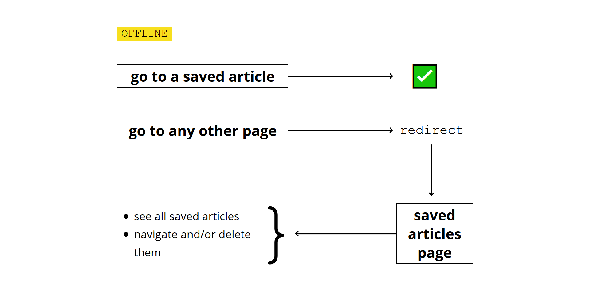
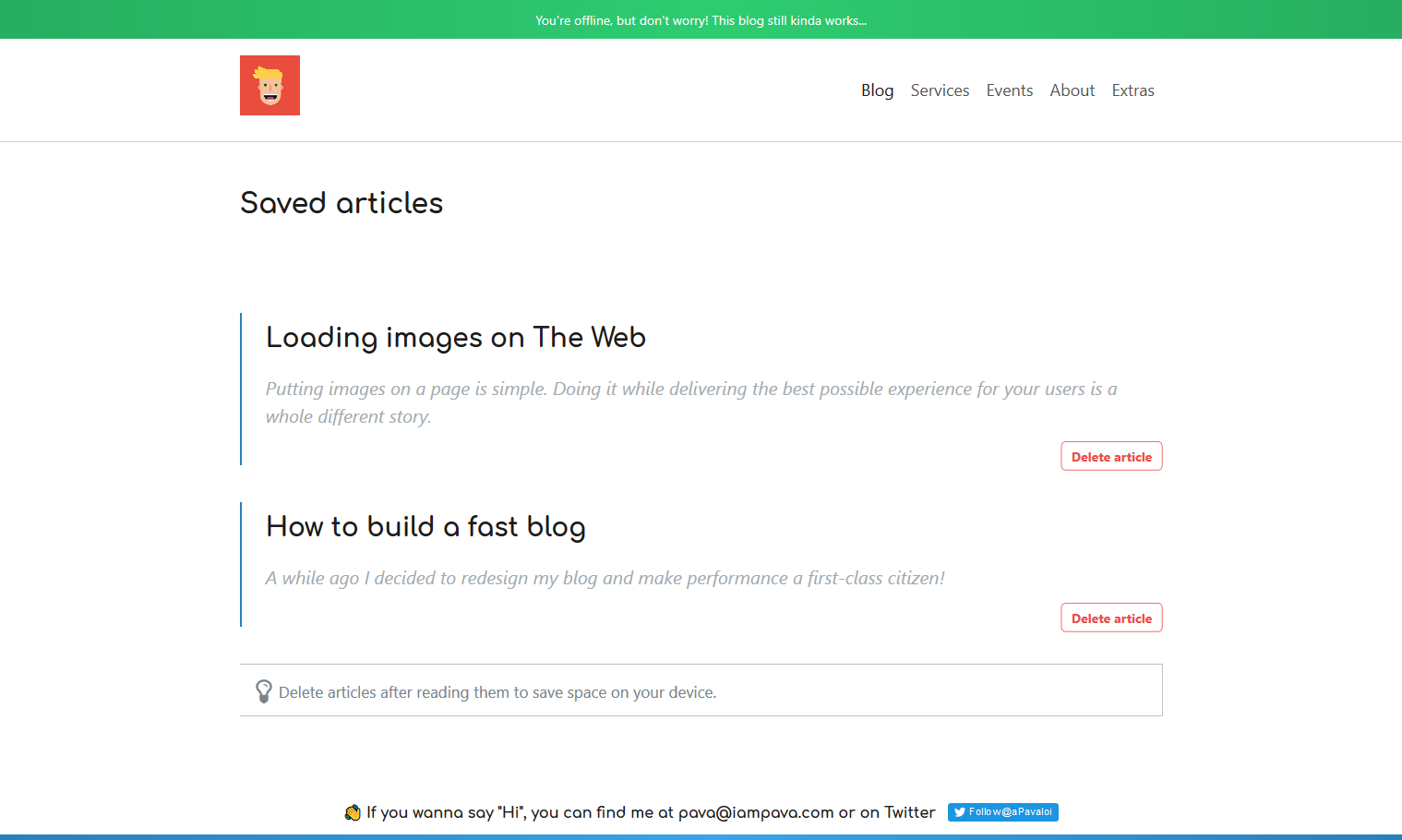
The situation is a little different if you're offline. Let's use an image since they're worth a thousand words!

To be honest, there's nothing inherently hard here but the devil is in the details. Due to the way this blog is built, primarily theoptimization of imageswhich are lazy loaded and responsive, figuring out which image assets to save for a particular article must take into account the device you're on.
There's also the situation in which I later update an article which you've already saved. I should somehow update the cache as well, so that you'll read the new version.
Caching structure
To allow individual saving and deletion of articles I'm going to create multiple browser caches, one for each article saved. I'm also going to create a separate one, callediampava-cache-{version} which will store the shared files among all articles plus the ones needed for the saved-articles page.
Notice the version placeholder which will be increased with every build, thus allowing the deletion of previous version caches since they are useless.

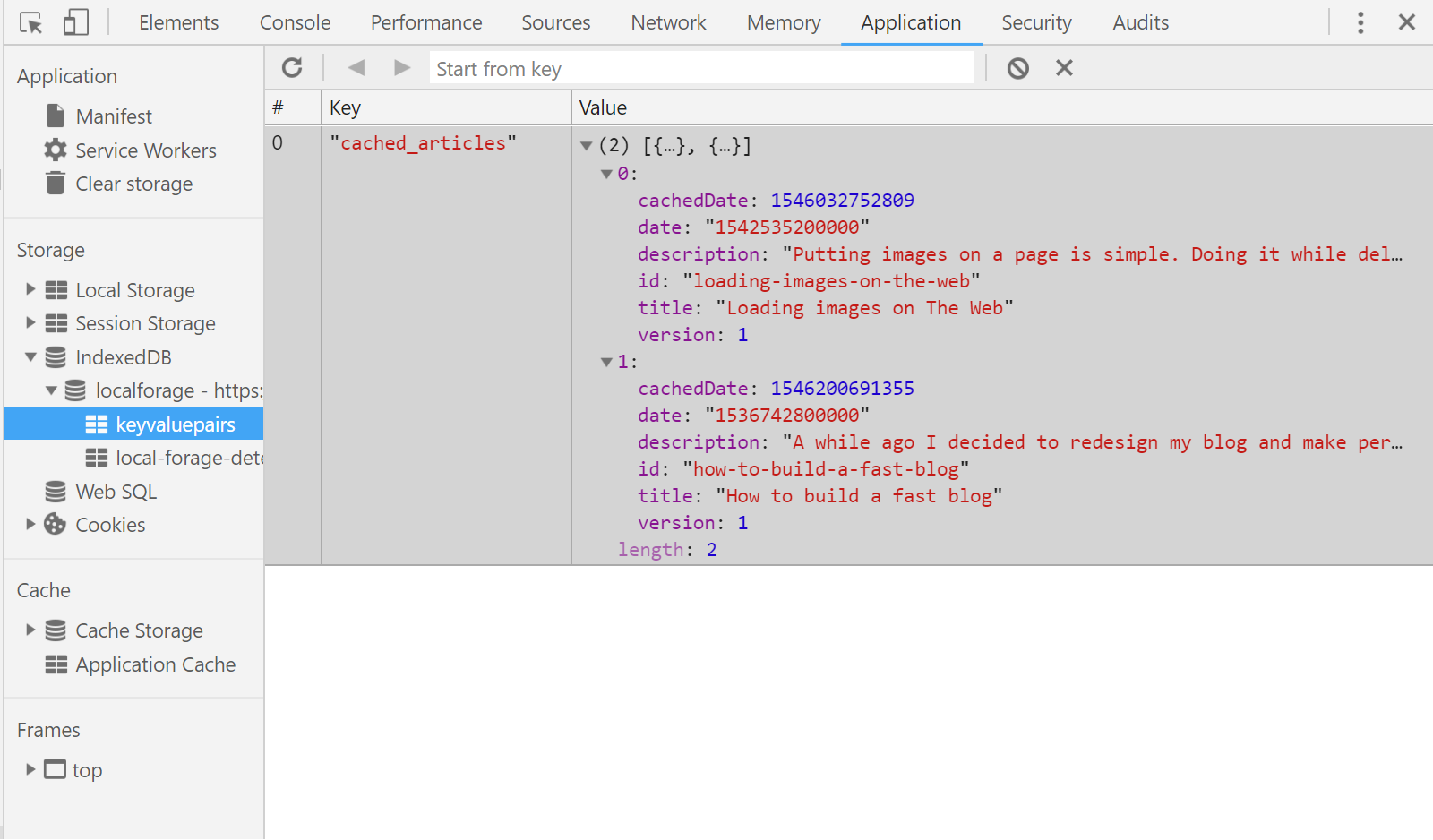
I also need to store some data about which articles have been cached, so that I can dynamically create the UI for the saved-articles page.

I chose IndexedDB for this because it's more robust and it can be accessed via a Service Worker if I might ever need it. Inside it I store a simple list of objects, each with a title, description, date and version number. I used the localforagelibrary to help with the rather verbose API of IndexedDB.

Choosing the right assets
As I mentioned earlier, when it comes to caching the more difficult part is actually choosing which image sources to cache since they are responsive as well as lazy-loaded. To be honest, even caching them might seem like some black magic if you've never worked with Service Workers before, so if you're in that situation I highly recommend reading about them right now from Google Developers blog and returning to this article afterwards.
Ok, back to the implementation. I've flirted with a couple of ideas but finally settled on this one: parsing the HTML of the article to figure out the assets I need to cache. When I got to the implementation, I discovered three scenarios, to which I wrote the following 3 functions.
The first and biggest of all handles the situation where we load responsive and possiblylazy-loaded images via the <picture> tag. I basically go through every <source> of each <picture>element and if it's srcset or data-srcsetattribute is a simple image source then I straight up include it.
<source srcset="simple-img.webp" type="image/webp"></source>Otherwise, if it contains size information, I'm using some RegExp to split it up and choose the best size for the current device screen.
 <source srcset="
          simple-img_max.webp 4000w,
          simple-img_med.webp 2000w,
          simple-img_low.webp 800w"
  type="image/webp">
</source>Here's the function which decides the best source for the current device. Quite complicated on a first glance but rather simple if you deep dive in the implementation.
 function getBestSource(srcset) {
  const ADJUSTED_SIZE = (window.devicePixelRatio || 1) * window.outerWidth;
  let bestSource = null;
  let bestWidth = Infinity;

  let srcsetParts = srcset.split(new RegExp(" |,|
")).filter(part => part);
  if (srcsetParts.length % 2 === 1) {
    throw new Error("Expected to have matching source to size.");
  }

  for (let i = 0; i < srcsetParts.length; i += 2) {
    let currentWidth = Number.parseInt(srcsetParts[i + 1]);

    if (currentWidth > ADJUSTED_SIZE && currentWidth < bestWidth) {
      bestSource = srcsetParts[i];
      bestWidth = currentWidth;
    }
  }

  return bestSource;
}The other 2 use-cases are much simpler. Getting the source from the <img>or<video> tags is a simple verification and array insertion.
 function getImgSources(containerEl) {
  let imgEls = [...containerEl.querySelectorAll("img")];
  return [
    ...imgEls.map(img => img.src),
    ...imgEls.filter(img => img.hasAttribute("data-src")).map(img => img.dataset.src)
  ];
}

function getVideoSources(containerEl) {
  return [...containerEl.querySelectorAll("video source")].map(sourceEl => sourceEl.src);
}But we're not done yet!
We know which assets to cache in order optimize performance but in order for the article page to display correctly we also need to cache it's CSS and JavaScript. Doesn't seem hard, let's just look at their names and cache those files, right?
Well, not so fast! To allow long-term browser caching I configured webpack to append a unique hash to their names. This is how they look right now:
articlePage.3f6c38c4ddfb7edb6311.cssarticlePage.fb4f1598a4b4d7c7ade6.js
but on subsequent builds their names will be different if their contents change.
However, I built resources-manifest-webpack-pluginwhich looks at the assets and generates a JSON file with their names upon on every build. This way, in my service worker I just read that JSON and cache all the contents inside.
 // service-worker.js
const VERSION = 1;
const CACHE_NAME = `iampava-cache-${VERSION}`;

self.addEventListener('install', event => {
  event.waitUntil(caches
    .open(CACHE_NAME)
    .then(cache => {
      return fetch("/resources-manifest.json")
        .then(resp => resp.json())
        .then(jsonResp => cache.addAll(jsonResp.map(name => `/dist/${name}`)))
    })
  )
});And with that we're pretty much done for this part! Remember to clear past caches when you don't need them.
Support later updates
For this I obviously need to somehow track when things change. Thankfully I don't care about all pages, just the ones the user has the potential of seeing while offline. After some digging I found 3 scenarios which matter:
- I update an article's content (text, images, videos) or it's included code (CSS, JavaScript)
- I update the code of the saved-articles page
- I update the header and/or footer of the blog which are included in all pages.
1) Article changes
My first thought was to solve this in a similar fashion as above, by comparing HTML strings with one another and re-caching if there's the smallest difference. However the more articles you've saved, the more HTML requests will be fired just to check that everything is up-to-date... which honestly is a waste.
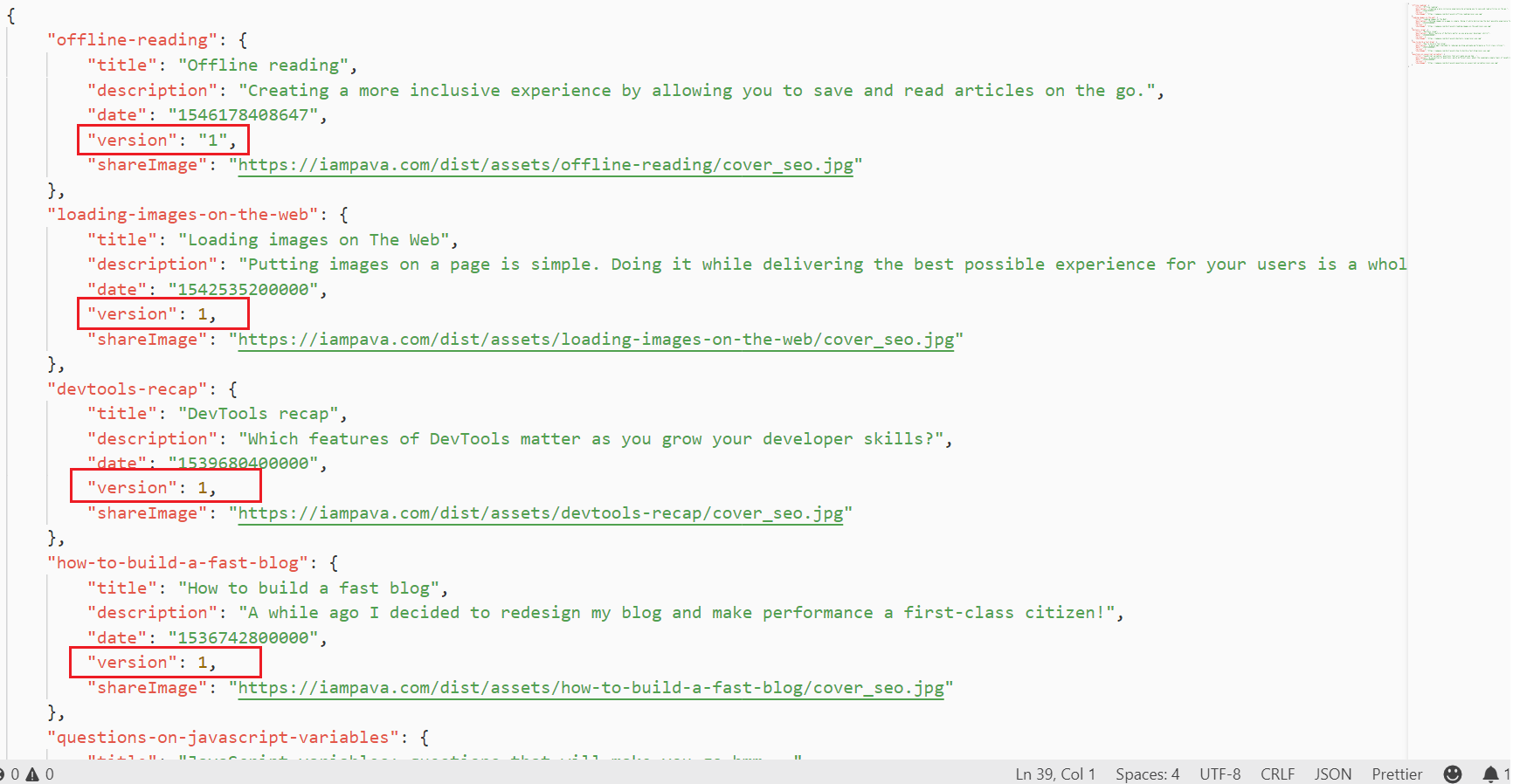
So, I opted for a more manual solution requiring me to keep versions of each article in the articles.jsonfile. This way I only make one request to find out all the updated articles.

2) Saved-articles page changes
This one's already done! I don't have to do anything more to enable later updates on this page because with every new service-worker we already download the latest code (CSS & JS) for it.
And all thanks to that Webpack plugin I've mentioned earlier.
3) General blog components change
Since the header and footer are generated from the PHP backend, I've got to be extra careful and remember to increase the version of all blog posts if I change the code there.
I know this is shitty and very error prone since I have to remember to increase the version onALL ARTICLES. But the only other way I can think of doing this is by requesting every HTML and manually diffing them... which in my opinion is way worse for the user.
Plus, considering that even if I forget to do it nothing's going to break, you'll just have an outdated UI, I guess I'll take this chance. But not before fiddling a little with my scripts to print a message every time I do the production build:

And with this we're done! Here's a full demo of the feature, but don't hesitate to try it out for yourself too!
Happy New Year! 🥂
- 1 PRPL pattern
Performance oriented way to structure and serve PWAs.
- 2 Awaiting reactions here:
🎉 New blog post just in time for the New Year and thus keeping my promise to write once/month!
— Alexandru Pavaloi (@_iampava) December 31, 2018
Have a great day and a superb 2019! Cheers 🥂
https://t.co/MkimZT2Wts#javascript#pwa #offline

I am Pava, a front end developer, speaker and trainer located in Iasi, Romania. If you enjoyed this, maybe we can work together?
