
Loading images on The Web
Putting images on a page is simple. Doing it while delivering the best possible experience for your users is a whole different story.

I honestly believe software is about the users whose problems are solved through it. Don't get me wrong, I love the newest thing just as much as the next developer, but in the end it's about the result.
From this perspective I want to approach performantly loading images on the web. Yes, our code is gonna get bigger, potentially harder to understand, while the chance of bugs will slightly increase. But their experience will get much much better which makes it worth it!
Thorough this article we'll be playing with just 3 images, which are actually the same image resized in different formats. The goal is to put them on the screen, in full width format.

I chose bikes because ever since I've lived in Netherlands I've fallen in love with this way of transport. But I digress, back to images!
Responsive images
We want the bike picture to be full screen but the actual size of this `full-screen` differs from device to device. The iPhone 5's screen has 1136 x 640px, a FullHD laptop has a 1980 x 1080 resolution while a 4K TV has a 3840 × 2160 pixels. So, including the same 2.2MB picture regardless of device is a terrible disregard of the user's experience & data plan.
Why load the full 10+ million pixels when on iPhone 5 the user can see just 727000 of them, less than 10% of the total size?
So the performant thing to do is to have the images change just like the layout does. On more high-resolution displays load a higher resolution image, while on smaller, mobile devices load a resized version. There are 2 scenarios to consider: puttin the images on screen via HTML or via CSS with thebackground-image property.
#1: Via HTML
One way to do it is to add the srcset attribute to the already known <img> tag, and specify multiple image sources together with their dimensions. Please don't remove the srcattribute, that's needed as a default in case the browser doesn't have support for srcset!
 <img srcset="bike_low.jpg 800w,
             bike_med.jpg 2000w,
             bike_high.jpg 4000w"
src="bike_med.jpg" alt="red bike">Behind the scenes the browser does a little `math magic` and then chooses the most appropriate image source. This means it use the smallest image big enough to fill the frame:
- bike_low.jpg if the screen is up to 800 pixels wide
- bike_med.jpg if it's between 800 and 2000
- bike_high.jpg if it's over 4000 pixels wide
This holds true assuming a 1-1 pixel ratio. For other types of screens the results in terms of what image is chosen will differ, but still it will be the best fit. 😁
The second way to do achieve this is via the <picture> tag. This one, just like the video element, can have multiple <source> children, each with a srcset attribute and an optional mediaone where we can insert CSS media queryes telling the browser when to use each source.
 <picture>
    <source srcset="bike_low.jpg"  media="max-width: 800px">
    <source srcset="bike_med.jpg"  media="max-width: 2000px">
    <source srcset="bike_high.jpg" media="min-width: 2000px">
    <img src="bike_med.jpg" alt="red bike">
</picture>We achieve the same result as before, the minor downside being we have to manually specify media query breakpoints, whereas in the first way the browser selects the best. That's why I recommend using the<img srcset="" src="">method but depending on usecase you might want more granular control so feel free to experiment and see which one is right for you.
#2: With CSS via the background-image property.
Here things are more straightforward. Just write multiple media queries and declare a differentbackground-imagein each one.
 @media screen and (max-width: 800px) {
  body {
    background-image: url('bike_low.jpg');
  }
}

@media screen and (min-width: 800px) and (max-width: 2000px) {
  body {
    background-image: url('bike_med.jpg');
  }
}

@media screen and (min-width: 2000px) {
  body {
    background-image: url('bike_high.jpg');
  }
}The code above will have the same result thus reducing load times and data consumption for our users.
🔨 Tools
All right, now that we know what we have to do, how can we automate this process? We're programmers after all and we shouldn't have to manually resize each and every image.
And we don't have to! Using the Sharp package I've built a small little script which automatically resizes each image and creates 3 new ones, while also appending_max, _med and _lowto the name so I know which one to include.
 const fs = require("fs");
const sharp = require("sharp");

const fileNames = fs.readdirSync("src/original-images");

Promise.all(fileNames.map(name => {
  const actualName = name.split(".")[0];
  const extension = name.split(".")[1];

  return Promise.all([
    sharp(`src/original-images/${name}`).toFile(`src/images/${actualName}_max.${extension}`),
    sharp(`src/original-images/${name}`).resize(2000).toFile(`src/images/${actualName}_med.${extension}`),
    sharp(`src/original-images/${name}`).resize(800).toFile(`src/images/${actualName}_low.${extension}`),
  ])
})).then(() => {
  console.log('\x1b[32m%s\x1b[0m', `Images succesfully resized!`);
});Next gen formats
Another way to reduce size and thus offer a better experience is to use newer image formats. WebPfor example is at least 25% smaller than it's JPEG/PNG counterparts. True, webp images are only supported in a couple of browsers but that's fine.
We shell use it in those browsers to deliver an enhanced experience, while on the rest we'll gracefully fallbackto regular formats.
Now that we know the why, let's move on to the HOW? Unfortunately, while at the previous chapter we had different ways to achieve our goal, both through HTML & CSS, here things are pretty limited. First there's no way to gracefully fallback to JPEGs or PNGs in case of images set via CSS.
In CSS you either use webp or you don't!
In terms of HTML, only the <picture> tag supports this kind of behaviour. Via it's <source> children we will set first the webpsources and then the default ones. This way, as the browser parses the document top-down and chooses the first source it supports, we make sure he'll prioritize webp.
 <picture>
  <source srcset="dist/assets/bike_low.webp 800w,
            dist/assets/bike_med.webp 2000w,
            dist/assets/bike_max.webp 4000w" type="image/webp" />

  <source srcset="dist/assets/bike_low.jpg 800w,
            dist/assets/bike_med.jpg  2000w,
            dist/assets/bike_max.jpg  4000w" type="image/jpeg" />

  <img src="bike_med.jpg" alt="red bike" />
</picture>🔨 Tools
To automate the creation of webp images I recommend a Webpack plugin I've built: imagemin-web-webpack-plugin. It gives the converted images the same name as the original which makes it easy to use in HTML.
 const ImageminWebpWebpackPlugin= require("imagemin-webp-webpack-plugin");

module.exports = {
    plugins: [new ImageminWebpWebpackPlugin()]
};Lazy loading
Up until now all the `magic` we've been doing was concerned with optimizing the heck out of every image. Now let's move our focus to optimizing the experience as a whole.
As Yoav Weiss explains in Smashing Book 6:
Most of the images on the web are downloaded, decoded and rendered only never to be seen, as [...] the user never scrolled that far. -
Let's prevent that from heppening by leveraging JavaScript and load images only when they're about to come into view. There are loads of libraries out there doing this, but for this blog and for DevDriveI've chosenlazysizes.
Besides being community supported, I've looked inside their code and they make use of the newer intersectionObserverwhich means that on supporting browsers it's as fast as ⚡!
On their GitHub page they have examples of more advanced usecases but for the sake of simplicity, if you just want to get it to work work, simply add the lazyload class to the <img> or<picture> elements, and transform the src & srcset attributes to custom attributes: data-src & data-srcset.
What if there's no JavaScript?
I admit that I don't know who are the people that use browsers without JavaScript, but what I do know is that images have been on The Web long before JavaScript. So it doesn't really make much sense to need JavaScript for images!
Plus, it goes against the entire `graceful fallback` way of thinking. 😡
Solutions?
Well, we have one. It will make our code bigger and potentially messier but it will provide 100% support even across no-js users. Tadaaam:
 <picture>
  <source className="lazyload" data-srcset="..." type="image/webp" />

  <source className="lazyload" data-srcset="..." type="image/jpeg" />
  <noscript>
    <img src="dist/assets/bike_med.jpg" alt="red bike">
  </noscript>
  <img className="lazyload" data-src="dist/assets/bike_med.jpg" alt="red bike" />
</picture>See what we did there? Cool right? 😂
And that brings us to the end of this story. As I promised we have more code, more tools and more things to think about.
But, our users don't feel this! They feel the app and the way it works and for that it totally makes it worth it! ❤
Cheers! 🥂
- 1 squoosh.app
Compress images right in the browser! - by Google
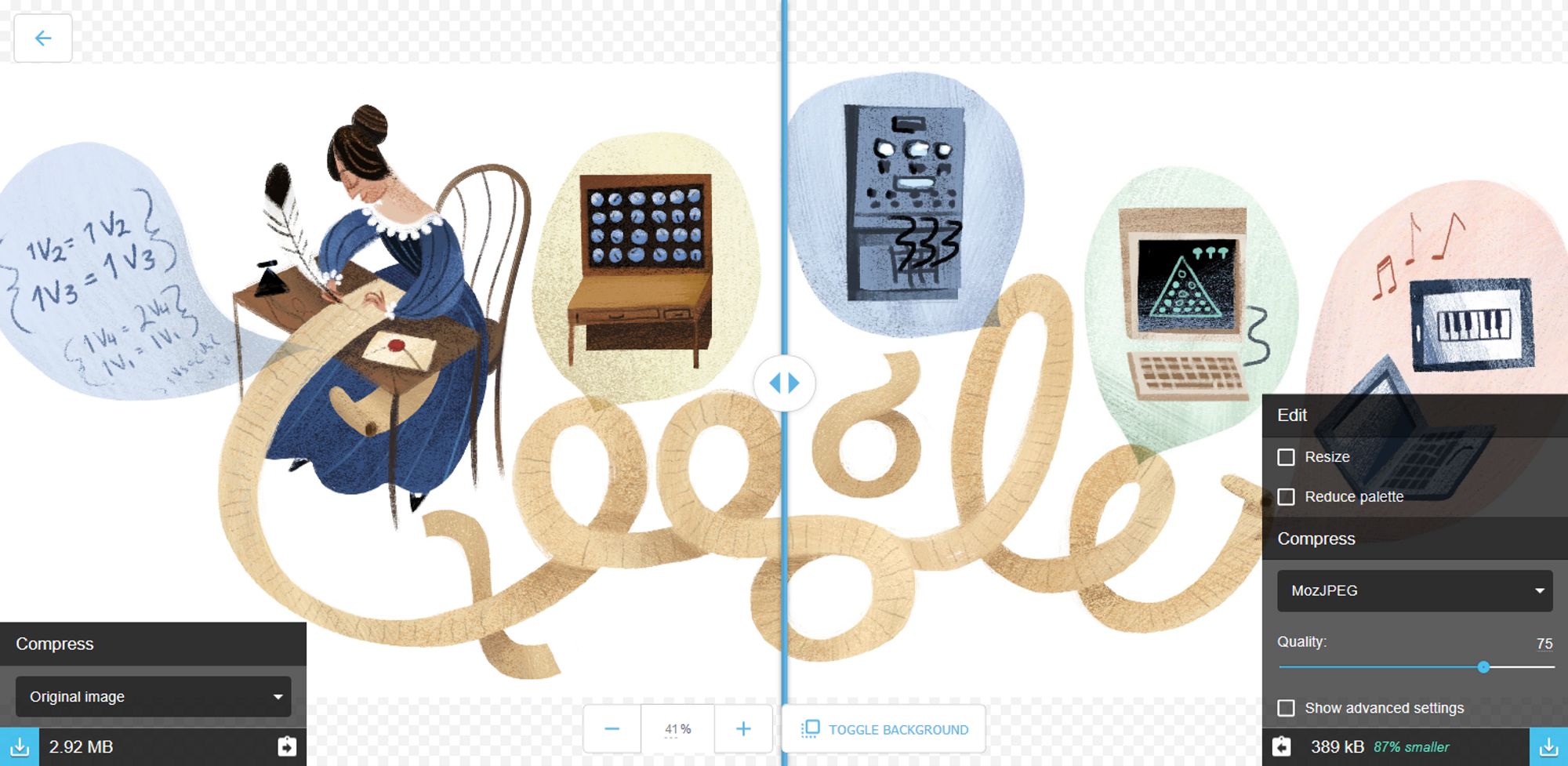
Screenshot of Google'sSquoosh.app - 2 GitHub repo
with everything from this article put into action!

I am Pava, a front end developer, speaker and trainer located in Iasi, Romania. If you enjoyed this, maybe we can work together?